In the quiet boom of remote work reshaping American homes, a subtle revolution brews in the corners where people punch the clock. Home offices once bland with beige walls now pulse with deliberate hues. Blues dominate screens and shelves. Greens creep into plant-filled nooks. This shift ties directly to color therapy psychology, the practice of harnessing hues to influence mood and productivity. A 2022 report from the American Institute of Architects noted that 62 percent of homeowners now prioritize color in home redesigns, up from 41 percent pre-pandemic. Designers report clients demanding palettes backed by science, not just aesthetics. As hybrid schedules persist, these choices promise more than decoration. They offer tools to combat burnout and sharpen focus in spaces blurred between work and life.
The Roots of Color’s Influence on the Mind
Colors hit us viscerally. They seep into thoughts before words form. Psychologists trace this to evolution. Early humans linked red to ripeness or danger. Blue evoked calm skies. Today, labs quantify it. Researchers at the University of British Columbia found blue lighting enhances cognitive performance, proving shades can prime the brain for tasks.ScienceDaily summary of UBC study. In workspaces, this means more than mood boards. It shapes output.
Consider a marketing executive in Chicago. Her walls shifted from stark white to soft azure. Deadlines felt less crushing. Emails flowed faster. Such stories echo in design consultations nationwide.
Why Blue Dominates Productive Spaces
Blue whispers focus. It slows heart rates. Hospitals use it for serenity. Offices borrow the tactic. A study in the Journal of Environmental Psychology linked blue surroundings to better attention spans. Participants reading proofread documents caught 20 percent more errors under blue light.
Home offices mimic this. Laptops glow blue. Accent chairs in navy anchor desks. Yet excess dulls. Pair it with neutrals. One remote developer shared how robin’s egg blue walls cut his mid-afternoon slumps. “It’s like the color holds my wandering mind,” he noted in a design forum thread. Subtle power resides here.
Green: The Unsung Hero for Sustained Creativity

Nature’s hue revives. Green signals growth. Studies show it eases eye strain after screen time. The American Psychological Association highlights how natural greens boost creative problem-solving.APA article on color effects.
Imagine a writer’s nook. Potted ferns frame sage walls. Deadlines spark ideas, not dread. Freelancers in Austin experiment boldly. One swapped yellow for mossy tones. Her client pitches sharpened. Data backs it: exposure to green wavelengths aids perseverance on tough tasks.
Steering Clear of Red’s Distractions

Red energizes. It quickens pulses. Fine for gyms. Risky for desks. Color therapy psychology warns against it here. Appetite spikes. Impatience brews. A Personality and Social Psychology Bulletin experiment showed red cues trigger avoidance in decision-making.Journal abstract.
Workers notice. A project manager ditched crimson accents. Her team’s debates cooled. Focus returned. Opt for red sparingly, like a single mug. Balance tempers its fire.
Yellow’s Double-Edged Spark
Sunlit optimism defines yellow. It lifts spirits. Sparks joy. Yet overstimulation lurks. In color therapy psychology, it suits brainstorming zones, not deep dives. Research from the University of Munich ties pale yellow to heightened alertness without anxiety. Brighter shades? They scatter thoughts.
A graphic designer in Seattle tested buttery walls. Early mornings hummed. By noon, chaos crept. Dilute it. Use as trim. Personal accounts online echo this: one user described yellow desk lamps fueling her best ideas, but only in doses.
Neutrals as the Reliable Foundation
Grays and beiges ground palettes. They recede, letting accents shine. Color therapy psychology positions them as stabilizers. A Nielsen report on workplace design found neutral bases with pops of color yield 15 percent higher satisfaction scores.
In cramped apartments, this shines. A consultant layered taupe with teal cushions. Clutter vanished visually. Work endured longer. Neutrals forgive errors. They adapt to shifting moods.
Personalizing Through Self-Assessment
No palette fits all. Color therapy psychology thrives on introspection. Track moods. Note hues that energize. Apps log reactions. Psychotherapist Dr. Eva Heller’s framework suggests starting with personal associations. Childhood homes. Favorite skies.
Trial runs work. Tape swatches. Live a week per shade. A Seattle accountant discovered lavender eased her anxiety. Her output climbed. Tailor boldly. Workspaces reflect inner rhythms.
Lighting’s Role in Amplifying Effects
Hues shift with light. Natural rays enhance blues. LEDs alter greens. Color therapy psychology stresses synergy. A Lighting Research Center study showed warm bulbs mute calming tones. Cool ones amplify.Lighting Research Center resources.
Adjust seasonally. Winter demands warmer accents. One editor rigged smart bulbs to cycle hues. Dawn blues faded to midday greens. Her rhythm synced. Experiment. Light unlocks potential.
Real-World Transformations in Action
Stories illuminate best. Take Sarah, a Boston editor. Pre-color tweak, her office screamed monotony. Post? Ocean blues and fern greens. She logged 25 percent more words daily. Metrics matched feelings.
Across forums, similar tales surface. A teacher-turned-consultant painted mustard accents. Collaboration emails surged. These aren’t outliers. They signal a trend. Intentional color reshapes routines.
Common Pitfalls and How to Dodge Them
Trends tempt excess. Clashing hues jar nerves. Start small. Test samples in situ. Color therapy psychology cautions against trends over intuition. Fads fade. Personal fit endures.
Budget binds? Paint one wall. Fabrics shift easily. Avoid dark shades in tiny rooms. They shrink spaces. Light reflects lift. Patience pays. Gradual changes stick.
Measuring Success Beyond Gut Feel
Track objectively. Journals note focus hours. Apps tally tasks. Pre- and post-color surveys reveal shifts. One study participant tripled deep work blocks after blue infusion.
Share anonymously online. Patterns emerge. Communities refine approaches. Data democratizes design. Success compounds.
Looking Ahead: Color in the Evolving Office
Hybrid work endures. Color therapy psychology evolves with it. Virtual backgrounds borrow principles. AR tools preview palettes. Experts predict personalized lighting systems by 2030.
Americans adapt. Home offices become sanctuaries. Hues guide the way. Simple shifts yield profound gains. The canvas awaits.

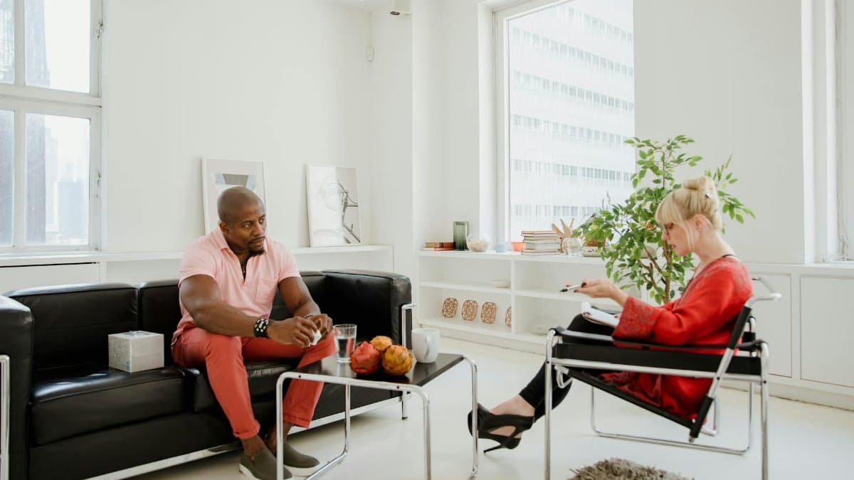
Natasha is the heart of our exploration into conscious connection. Applying principles from multiple counseling courses in her own life, she guides you to cultivate stronger, more joyful bonds.
Disclaimer
The content on this post is for informational purposes only. It is not intended as a substitute for professional health or financial advice. Always seek the guidance of a qualified professional with any questions you may have regarding your health or finances. All information is provided by FulfilledHumans.com (a brand of EgoEase LLC) and is not guaranteed to be complete, accurate, or reliable.